Insights & Articles from studionova
Popular Tags
No articles found matching your criteria. Please try different filters.
Mastering Responsive Web Design: A Comprehensive Guide
By Jane Doe
Published on October 26, 2023
Development
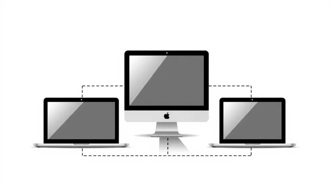
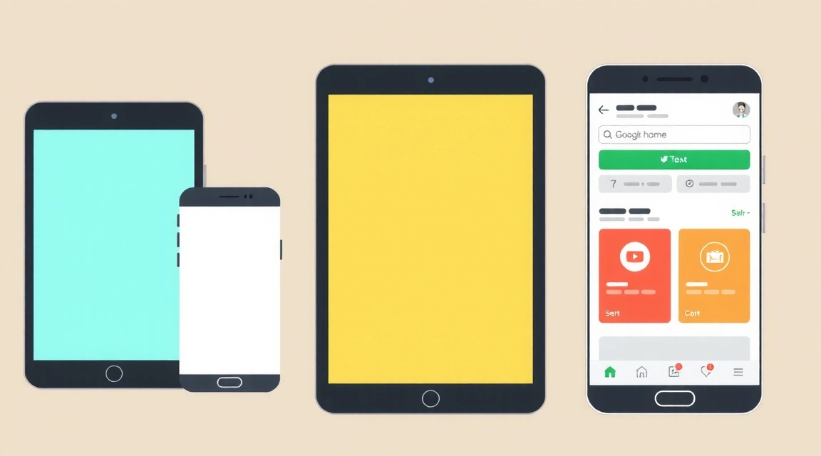
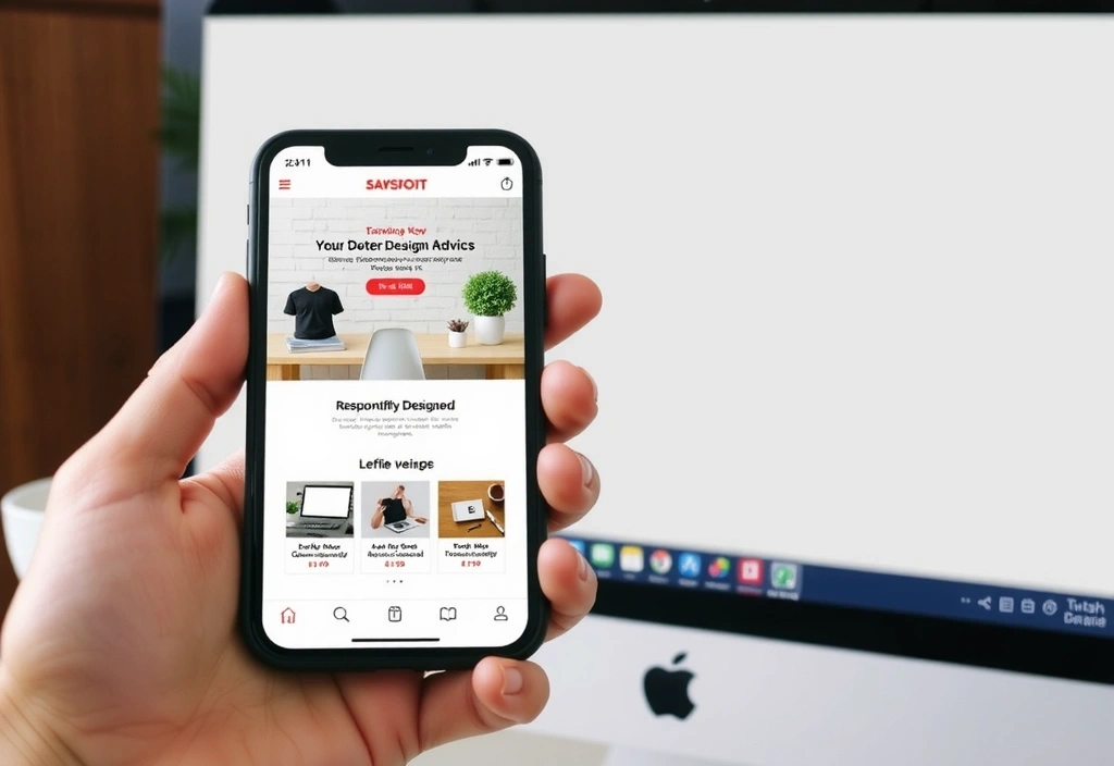
In today's multi-device world, responsive web design (RWD) is no longer a luxury but a fundamental necessity. Users access websites from an ever-growing array of devices—smartphones, tablets, laptops, and even smart TVs—each with varying screen sizes, resolutions, and interaction methods. A truly effective website must adapt seamlessly to provide an optimal viewing and interaction experience across all these platforms.
What is Responsive Web Design?
Responsive web design is an approach to web development that makes web pages render well on a variety of devices and window or screen sizes. Ethan Marcotte coined the term in 2010, advocating for a design philosophy that responds to the user's environment. This involves a mix of flexible grids and layouts, images, and an intelligent use of CSS media queries.
"The control which designers know in the print medium, and often desire in the web medium, is simply a function of the limitation of the printed page. We should embrace the fact that the web doesn’t have the same constraints, and design for this flexibility."— Ethan Marcotte
Key Principles of RWD
- Fluid Grids: Instead of fixed-width layouts, responsive designs use percentage-based grids. This allows elements to stretch or shrink proportionally as the viewport changes.
- Flexible Images: Images and media are scaled using relative units (like percentages) to prevent them from breaking the layout or overflowing their containers.
- Media Queries: These CSS rules allow developers to apply different styles based on device characteristics, such as screen width, height, resolution, and orientation.
- Mobile-First Approach: Designing for mobile devices first and then scaling up to larger screens often leads to better performance and a more focused user experience.
Why is Responsive Design Crucial for Your Business?
Implementing responsive design offers numerous benefits that directly impact a business's online presence and bottom line:
- Improved User Experience: A consistent experience across devices reduces frustration and increases engagement, leading to higher conversion rates.
- Increased Reach: With over half of global web traffic coming from mobile devices, a responsive site ensures you don't alienate a significant portion of your audience.
- Better SEO Rankings: Google favors mobile-friendly websites and penalizes those that aren't. RWD is a key factor in achieving higher search engine rankings.
- Cost-Effectiveness: Maintaining a single responsive website is often more economical than developing and managing separate websites for different devices.
- Future-Proofing: RWD helps your website adapt to new devices and screen sizes as they emerge, reducing the need for frequent redesigns.
Implementing Responsive Design: Key Considerations
- Viewport Meta Tag: Essential for telling browsers how to scale the page.
- CSS Media Queries: Use breakpoints to apply styles at specific screen widths. Common breakpoints include for mobile, tablet, and desktop.
- Fluid Typography: Adjust font sizes and line heights based on viewport width for optimal readability.
- Performance Optimization: Responsive sites must load quickly on all devices. This involves optimizing images, minimizing CSS/JS, and leveraging browser caching.
- Touch Target Sizes: Ensure interactive elements (buttons, links) are large enough and spaced adequately for easy tapping on touchscreens.
At studionova, we specialize in crafting responsive websites that not only look stunning but also perform flawlessly on every device. Our team leverages the latest RWD techniques to deliver solutions that are engaging, accessible, and optimized for search engines. Partner with us to ensure your digital presence is robust and ready for the future.
About the Author

Jane Doe
Senior Web Designer at studionova, with over 10 years of experience in creating user-centric and visually appealing digital experiences. Passionate about responsive design and accessibility.
Related Posts

The Evolution of SEO: What You Need to Know in 2024
November 10, 2023